Colors Matter: Exploring cols4all for Better Data Visualization
👉 Question for you: What is your go-to tool for choosing color palettes in your visualizations?
Why Colors Matter
In data visualization, colors are more than decoration. They guide attention, improve readability, and even determine whether insights are understood correctly.
Think about it: if the difference between red and green is too subtle, someone with color vision deficiency may not see the contrast at all. In that case, the message of your chart could be completely lost.
This is why choosing colors carefully is essential—not just for aesthetics, but also for accessibility.
Discovering cols4all
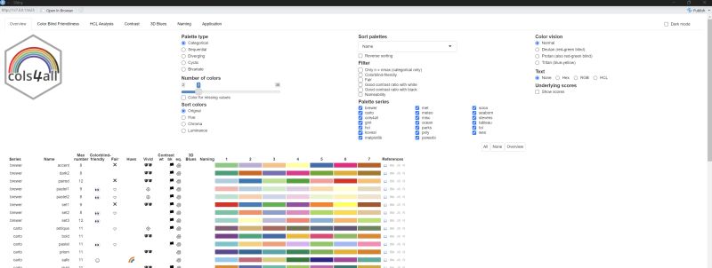
Recently, I explored the R package cols4all. It provides a rich collection of palettes and a powerful GUI for selecting the right ones.
With c4a_gui(), you can:
- Filter palettes by type: categorical, sequential, diverging, cyclic, bivariate.
- Adjust the number of colors depending on your needs.
- Test accessibility for color vision deficiencies.
- Compare palettes with built-in scores for contrast and colorblind-friendliness.
For anyone who needs to balance beauty with clarity, this feels like a game changer.
Easy Integration with ggplot2
Using these palettes with ggplot2 is straightforward. For example:
scale_fill_manual(values = c4a("brewer.set3"))
You can also pick specific colors from a palette and assign them to categories, giving you both consistency and flexibility.
Practical Value In one project, I had to display data from multiple clinical trial groups. A simple red/blue/green scheme quickly became confusing once the number of groups exceeded five.
With cols4all, I could identify a colorblind-friendly palette with clear contrast in just a few clicks. That meant doctors, statisticians, and non-technical stakeholders could all interpret the chart without difficulty.
The result? Charts that were not only professional-looking, but also universally readable.
Takeaway What I love about cols4all:
✔️ It goes beyond making charts pretty—it makes them understandable for everyone.
✔️ It saves time by avoiding endless trial-and-error in color selection.
✔️ It combines aesthetics with accessibility, increasing the impact of your visualizations.